

Brand identity and truck livery for TSE Transport Services Europa
For TSE we designed the livery for its tractor units and trailers, and carried the identity through to business cards, a presentation, a folder and forms for drivers.

- Client
- TSE Transport Services Europa
- Sector
- Transport and logistics
- Market
- The Netherlands and Europe
- Services
- BrandingPrint and signage
Last updated
Where the identity had to work
TSE is an Amsterdam transport company with its own tractor units and trailers, carrying goods in the Netherlands and across Europe. Its identity had to work on the cab of a tractor unit, on the side of a trailer and on a business card.
What we made for TSE
We supplied the logo files in colour, black and white, and designed the livery for the tractor units and for the sides of the trailers. For the trailers we first made a series of proposals, then print-ready files with the measurements for each side. On paper we carried the identity through to business cards, a six-page A4 presentation, a presentation folder and three forms for drivers.
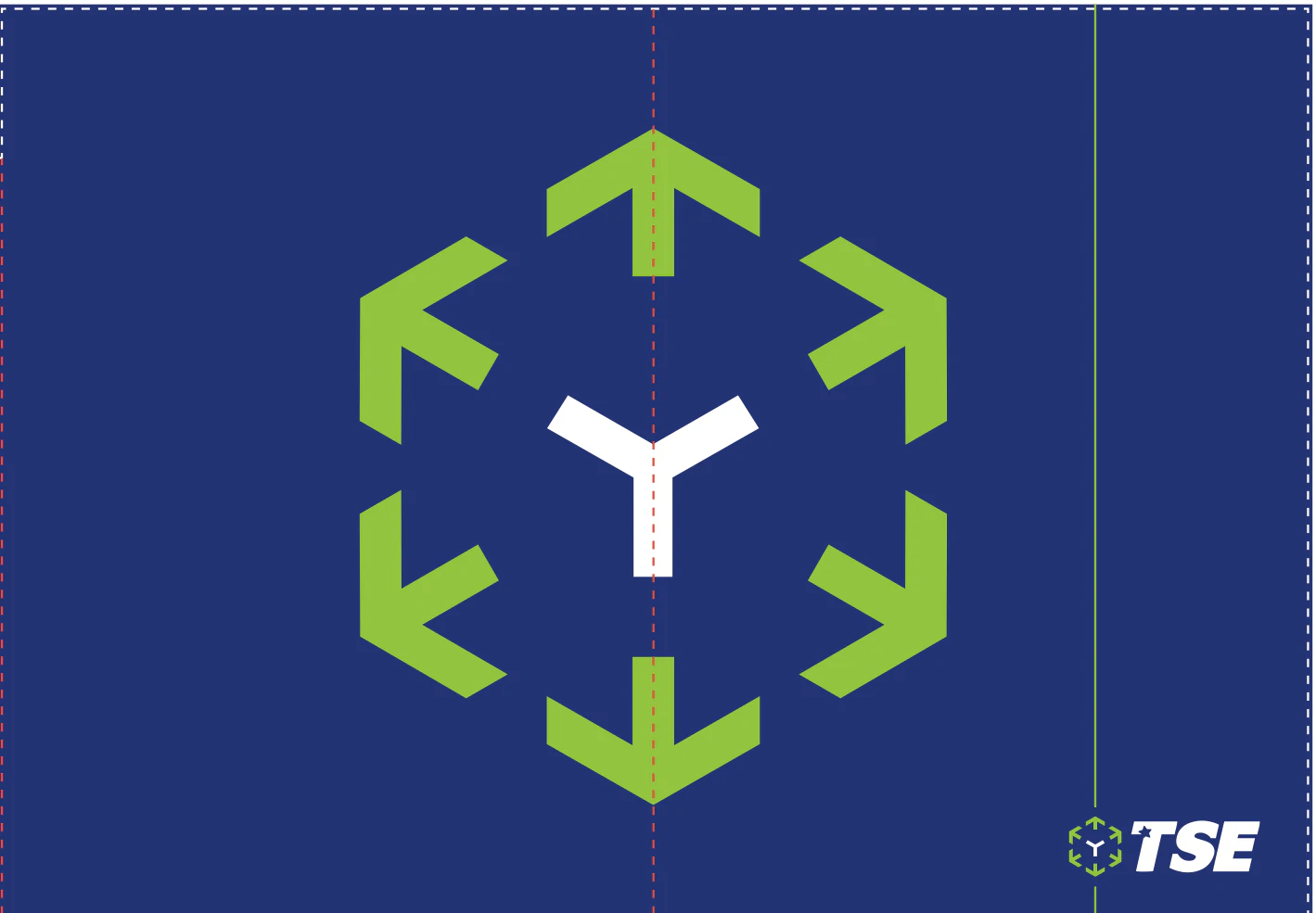
The presentation folder as a print file, with its die-cut and fold lines.


We make the licence plates and the driver in the photos unrecognisable.
In use
Where the identity runs today
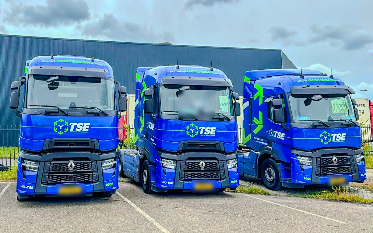
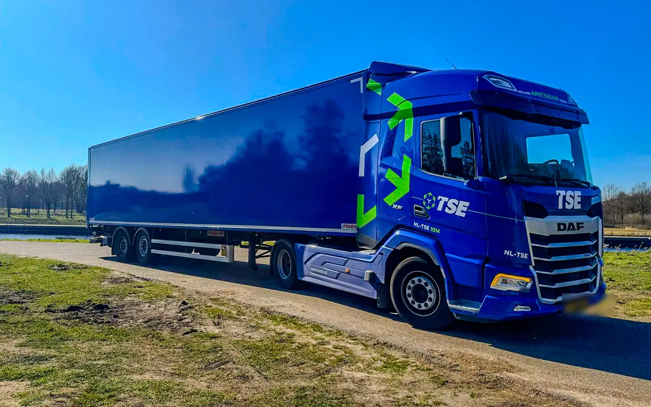
The livery runs on TSE's tractor units, with green arrows on the cab, the logo on the door and the website on the side.
Source: photos of TSE's tractor units.
Key facts about TSE
- Vehicles
- Livery for tractor units and trailers
- Trailers
- Print-ready files with the measurements for each side
- Business cards, A4 presentation and presentation folder
- Forms
- Weekly timesheet, trip report and vehicle check
One identity for the road and for paper
An identity for a transport company has to work in very different places. You see the cab of a tractor unit from far away, the side of a trailer stands by the road all day, and someone holds a business card in their hand. So we started with the basics: the logo files in colour, black and white, so every printer and supplier that works for TSE can use the same files.

Livery for tractor units and trailers
On the tractor units, green arrows run across the cab, the logo sits on the door and the grille, Holland, Amsterdam, Europa runs above the windscreen and the website is on the side. That makes a TSE vehicle easy to recognise from the front and from the side.
For the trailers we first made a series of proposals. Then came the print-ready files for the left and the right side, with the measurements for each side, so any trailer can be lettered to the same measurements. The side carries the line Transport as a Service, with the website and the TSE wordmark.
Business cards, presentation, folder and forms
On paper we carried the identity through to business cards, a six-page A4 presentation and a presentation folder with the large brand mark on the outside. For the drivers we made three forms in the same style: a weekly timesheet, a trip report and a vehicle check. The new timesheet replaces the form TSE used before. Everything a customer or a driver of TSE holds in their hands now looks like the vehicles on the road.
What TSE can do on its own now
With the print-ready files and the measurements for each side, TSE can have any trailer lettered without a new design. The driver forms use the same identity as the vehicles and the print.
Services and further reading
Next case study: Private Label Specialist, our own brand with a B2B catalogue
The site is a B2B catalogue of 234 pages in two languages, with a quote basket instead of a checkout.
