

Case studies of the brands, sites and systems we built
Each case study names the client and shows what we built. Every figure on it comes with its source.
Client work
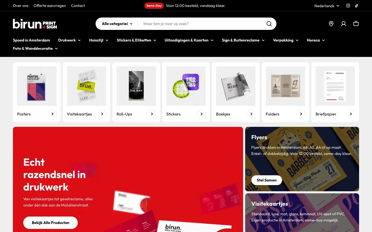
Birun Print & Sign
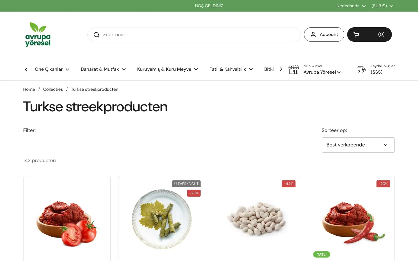
Avrupa Yöresel
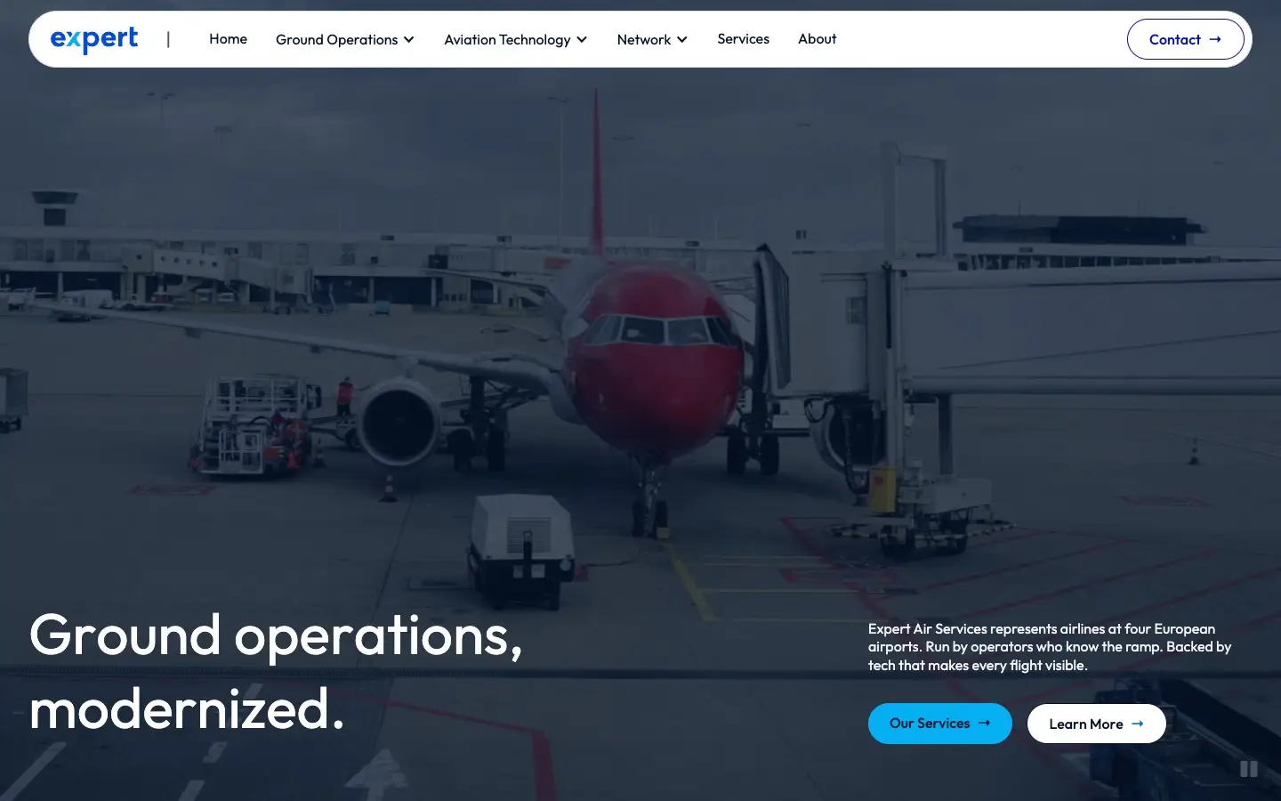
Expert Air Services
Example: weekly deliveries leave Amsterdam for locations across Europe. Where it fits, we handle sourcing and storage in Türkiye. Glomacs and AZTech
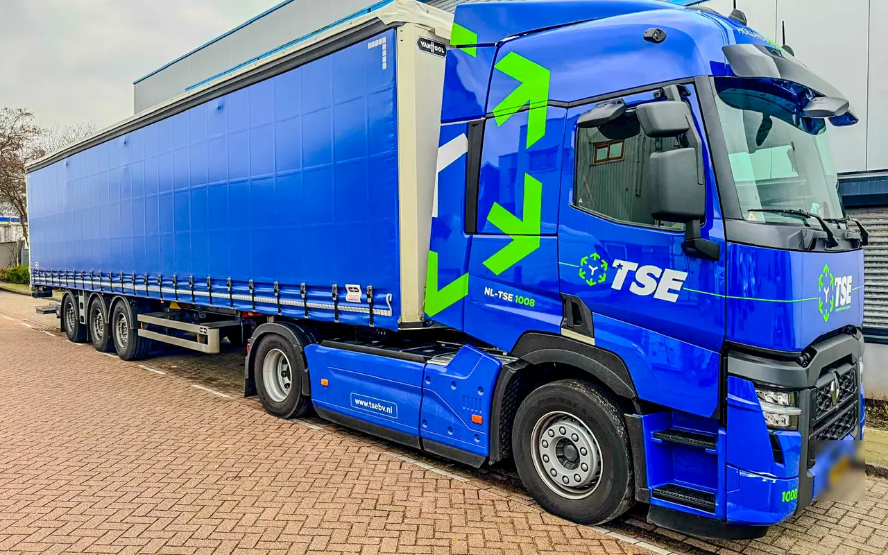
TSE Transport Services Europa


More client work
Alongside the case studies above, we made identities, print and signage for other clients. We leave out personal details, prices and licence plates.
Young Entrepreneurs
Wordmark, monogram and social templates
See the work (3)
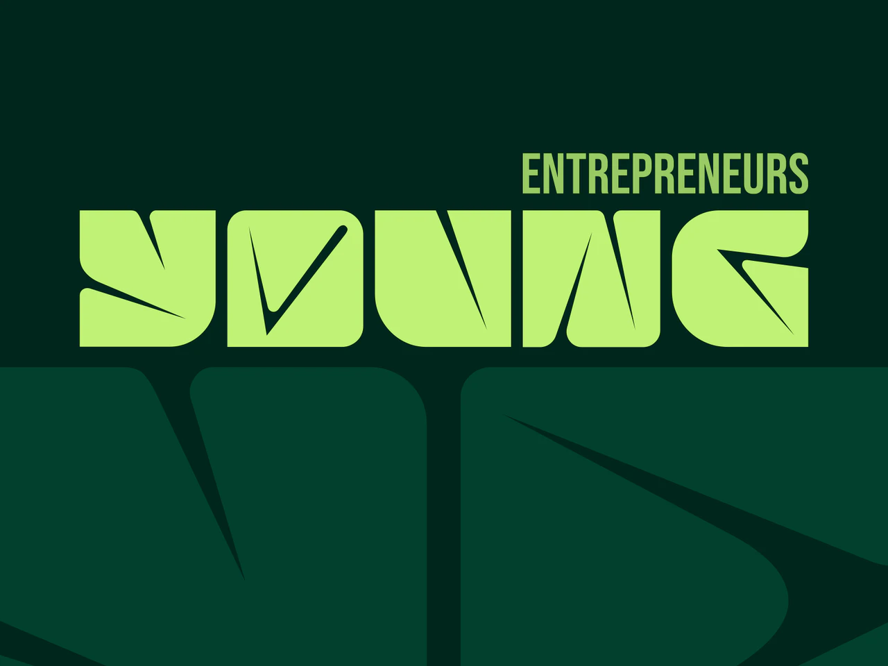
For Young Entrepreneurs we designed an identity with a custom wordmark, a YE monogram and 36 logo variants, plus feed and story templates in a light and a dark version. The identity also covers the logos of three sub-brands: Sportnation, MDT and Dynamo.
Goedkoopvloer
Logo and shopfront graphics for a flooring shop
See the work (3)
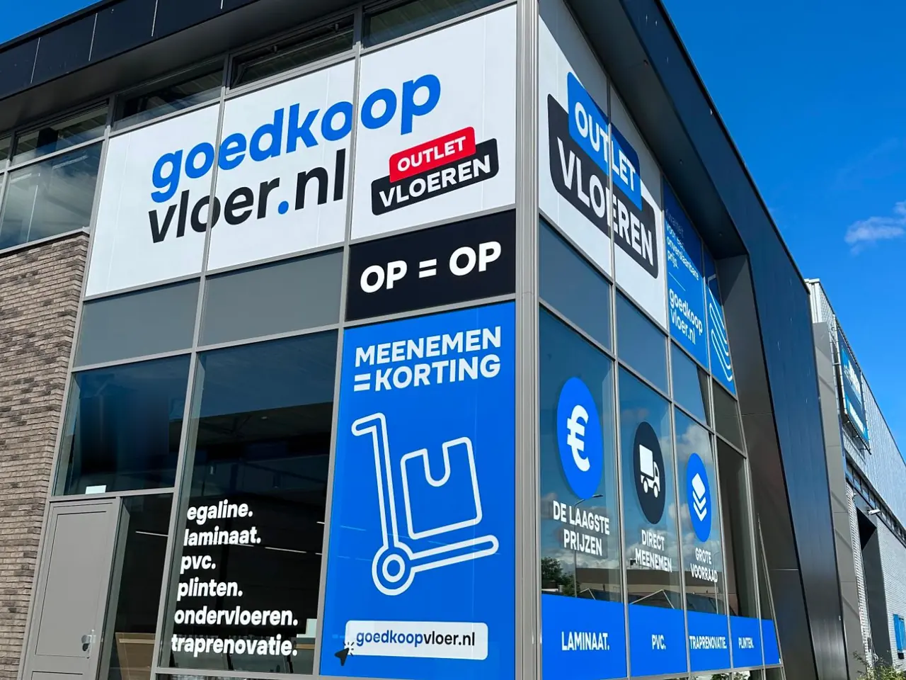
For Goedkoopvloer, a flooring shop in Amsterdam, we designed a new logo: a two-line wordmark in bright blue and black with a blue dot. We then designed the window and facade graphics, with the logo, an outlet sticker, the product ranges and what the shop offers.
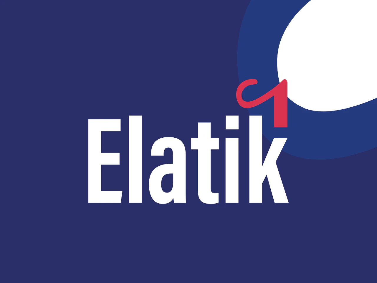
Elatik Consultancy
Wordmark, identity and stationery for a consultancy
See the work (2)
For Elatik Consultancy, an Amsterdam consultancy, we designed a wordmark with a red, handwritten curl on the k and a palette of three blues, a bright red and light grey. The curl returns as a brand mark and as a large shape on the business card and the letterhead.
We leave the contact details on the stationery out.
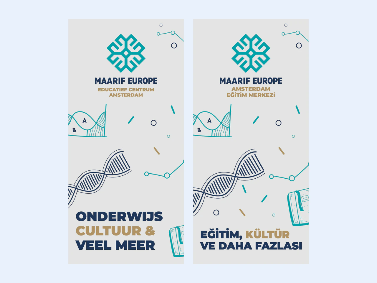
Maarif Europe
Bilingual brochure and presentation card
See the work (2)
For Maarif Europe, an education centre in Amsterdam, we designed a tri-fold A4 brochure in Dutch and Turkish that sets out the centre's language courses, homework support, sport and music, with line illustrations we drew ourselves. It comes with a two-sided A5 presentation card with the centre's logo.
Photos and contact details from the brochure are left out.
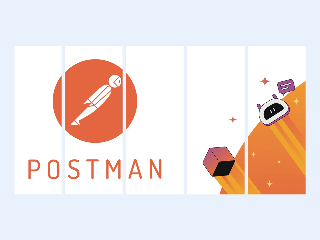
Volition Events
Window graphics and wall panels for an event
See the work (2)
For Volition Events we designed the artwork for a Postman event in Amsterdam, with window graphics across the whole facade and a print file for every pane. The wall panels for a straight wall and a U-shaped wall show a sun, clouds, stars and a rising cube.


The brands we run ourselves
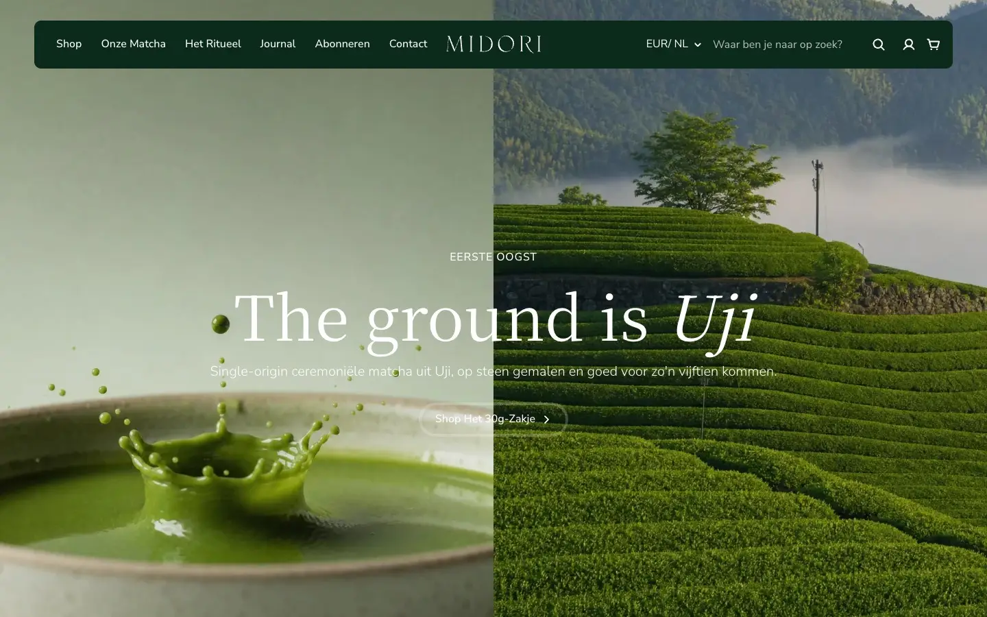
Private Label Specialist and Midoricha are our own brands, built by the same team that works for clients. We show them apart from client work. For these two you see what is live today, and there are no client results to report.
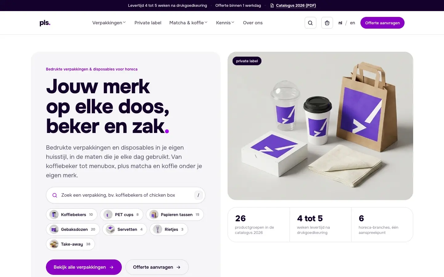
Private Label Specialist


How our case studies work
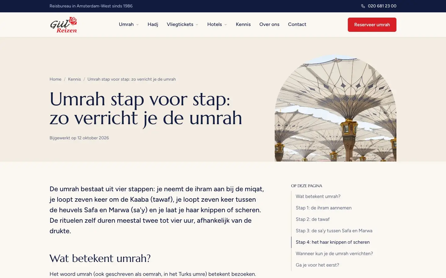
Every case study tells the same four things: where the client started, what we did, what it delivered and what the client can now do on their own. Each number comes with its source, such as the live site, our own audit or a measurement we dated. The Gül Reizen results, for example, come from one measurement on one day, 12 October 2026.
What the case studies cover
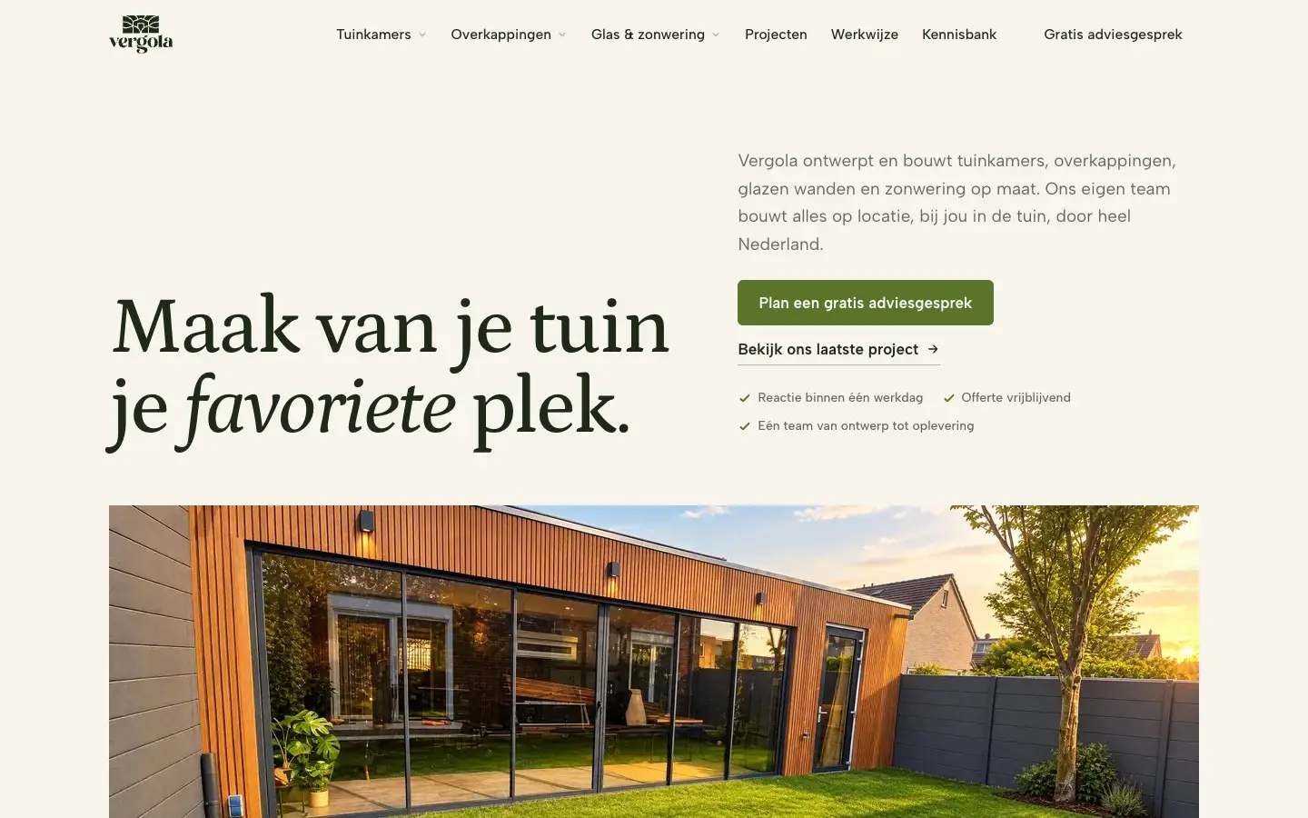
Some are about a brand, such as the livery on the tractor units of TSE, an Amsterdam transport company. Others are about a Shopify store with product configurators, as at Birun Print & Sign, or about digital delivery notes, as at Expert Air Services. The clients work in print and signage, travel, regional food products, aviation, transport, training and garden rooms.